
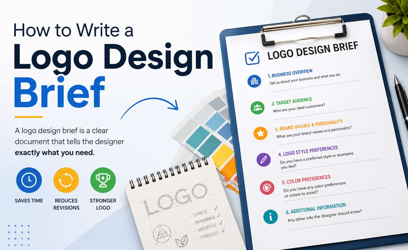
A logo designer can only solve the right problem if the brief clearly explains what the business needs the logo to communicate and where the logo will be used.
A logo design brief turns a vague request into a workable project. It supplies the business context, audience, positioning, practical constraints, and creative direction a designer needs to produce relevant options instead of guessing. Vague briefs create unnecessary revision rounds and mismatched concepts because the designer is forced to invent both the problem and the solution. A good brief does the opposite: it defines the problem and the boundaries while leaving the visual solution open.
This guide shows you how to write a brief that is clear, useful, specific, and creatively open. You will learn what information belongs in the brief, why each part matters, how to prioritize when information conflicts, how to label requirements versus preferences, how to handle redesigns, and how to test the finished brief before you send it. By the end you will have a practical decision-making system and a ready-to-use template.
What Is a Logo Design Brief?
A logo design brief is a short, structured document that gives a designer the information needed to understand the project and begin work with confidence. It establishes business context, defines the communication objective, lists practical requirements and constraints, and communicates preferences and references. Its purpose is direction, not prescription.
It is not a logo sketch. It is not a complete brand strategy document. It is not a mood board by itself. It is not a demand that the designer reproduce a competitor’s mark or a reference you particularly like. And it is not a list of exact visual instructions that leave no room for professional exploration.
A well-written brief answers three practical questions:
- Who is this business and who must the logo speak to?
- What problem is the logo supposed to solve or what shift is it meant to support?
- Where will the logo actually appear, and what technical requirements follow from that?
When those areas are clear, the designer can focus creative energy on solving the right problem.
What Makes a Good Logo Design Brief?
More information does not automatically produce a better brief. Useful briefs are selective.
| A Good Brief Is | What That Means |
|---|---|
| Clear | The designer understands the business and the objective |
| Specific | Important requirements and constraints are defined |
| Relevant | Every piece of information can influence a design decision |
| Honest | Preferences, limitations, and budget are realistic |
| Focused | Unnecessary history or internal politics are left out |
| Flexible | The exact visual solution is not dictated |
| Actionable | The designer knows what must be delivered and by when |
The goal is enough clarity for the designer to start strong and enough openness for professional exploration.
How to Prioritize Information in a Logo Brief?
Not every field carries equal weight. Presenting eighteen elements as if they are all mandatory makes the process feel heavier than it needs to be and can lead readers to over-specify secondary details while under-specifying the essentials.
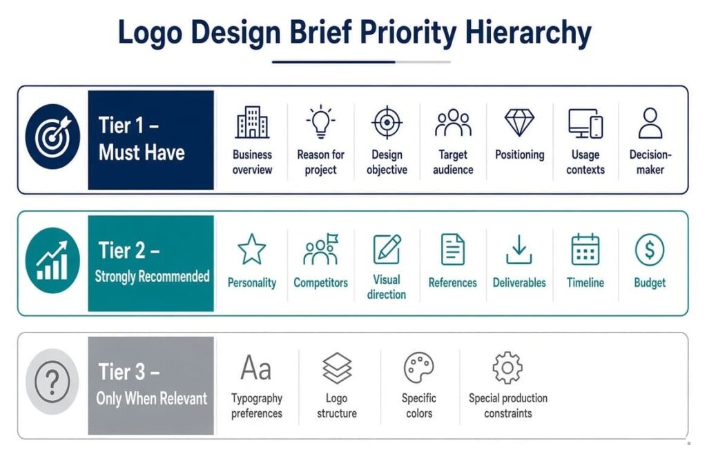
Tier 1 — Must Have
These items allow a designer to begin solving the right problem:
- Business overview
- Reason for the project
- Design objective
- Target audience
- Positioning / differentiation
- Primary usage contexts
- Decision-maker and approval process
Tier 2 — Strongly Recommended
These items significantly improve the quality and efficiency of the work:
- Brand personality
- Competitors and visual landscape
- Visual direction (preferences, not prescriptions)
- References with reasons
- Required deliverables and variations
- Timeline and budget range
Tier 3 — Only When Relevant
Include these only if they apply to the project:
- Typography preferences
- Specific logo structure preference
- Existing color system requirements
- Special production constraints (embroidery, engraving, unusual substrates)
- Detailed legal or trademark notes
The Must / Prefer / Avoid / Open Framework
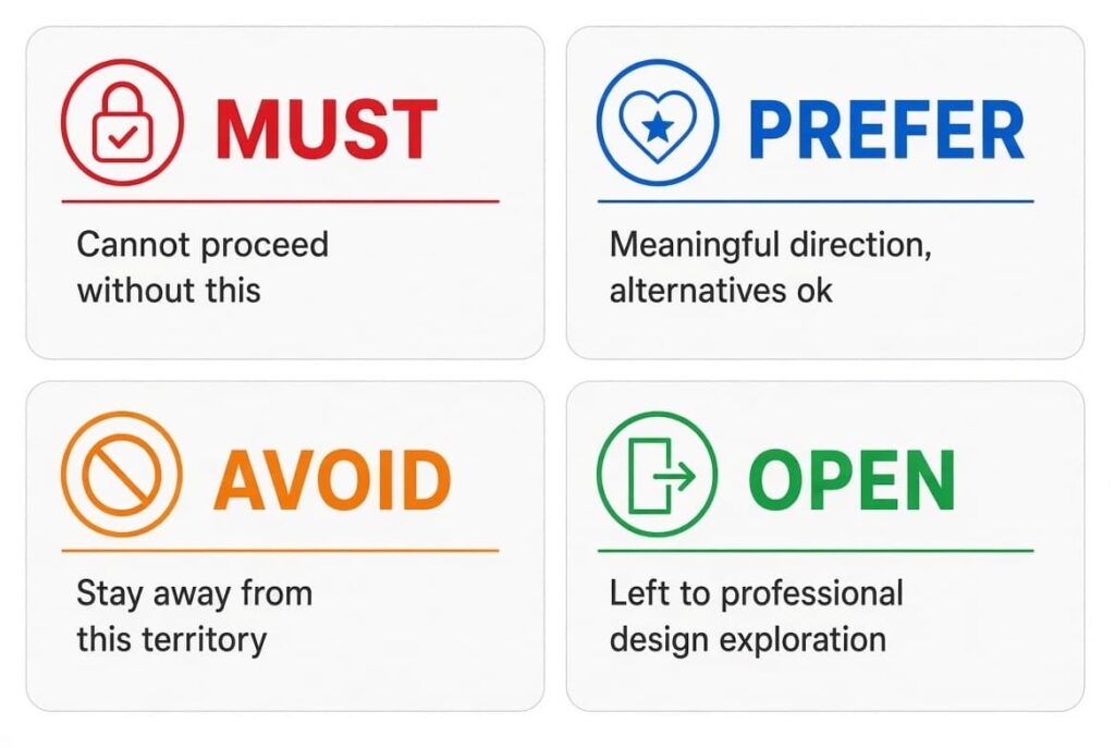
Classify every statement in the brief using one of four labels. This prevents preferences from accidentally becoming hard requirements.
- Must — The designer cannot reasonably proceed without this information or constraint.
- Prefer — Meaningful direction, but alternatives are acceptable.
- Avoid — Territory the designer should generally stay away from.
- Open — Intentionally left to professional exploration.
Example:
“We prefer a clean, minimal style (Prefer). The logo must remain legible at 16 px and work in one color (Must). Avoid ornate scripts and complex gradients (Avoid). Logo structure is open (Open).”
This single classification system reduces ambiguity more effectively than long descriptive paragraphs.
The Essential Elements of a Logo Design Brief
For every element you will see what to include, why the designer needs it, the appropriate level of detail, and the difference between a weak answer and a useful one.
1. Company or Brand Overview
What to include
Business name, industry, core products or services, business model if relevant, stage of the business, and geographic market when it affects perception.
Why it matters
The designer needs to understand what the business actually does before any visual thinking begins.
Level of detail
One or two short paragraphs. Do not write the full company history.
Weak
“We are a modern company offering many services.”
Useful
“We provide bookkeeping and accounting services to small businesses in Canada, with a focus on online consultations and recurring monthly support packages.”
2. Why Do You Need a Logo? (Including Redesign Equity)
What to include
The reason the project exists now: new business, rebrand, outdated identity, digital usability problems, merger, expansion, or new product line.
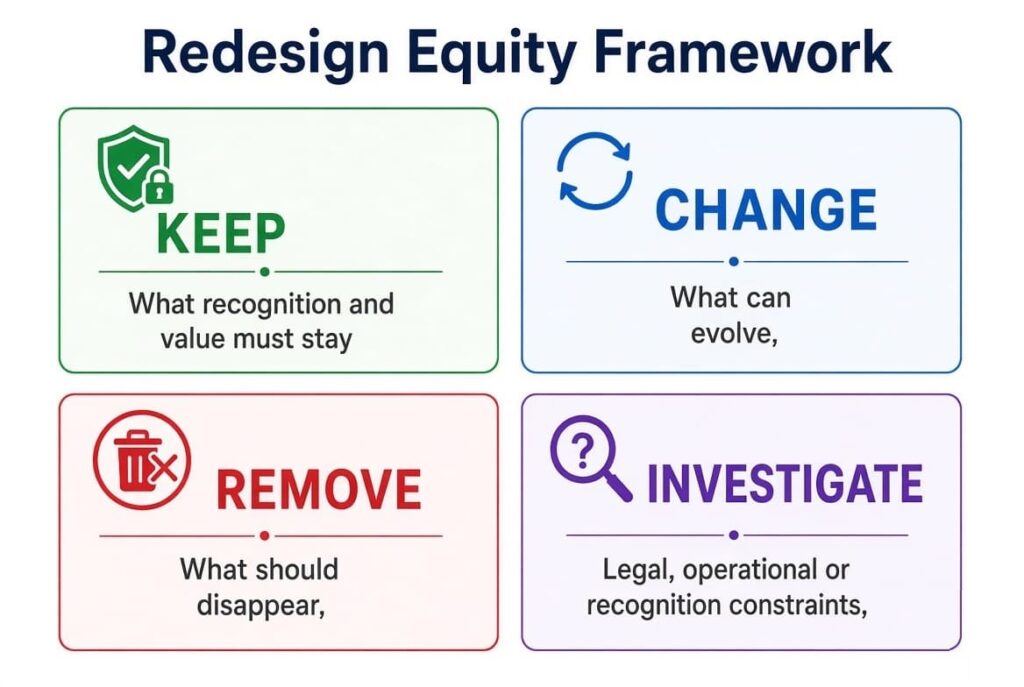
For redesigns, add an Existing Equity section
Ask and answer:
- What recognition already exists with customers?
- Which parts of the current identity have measurable customer value?
- What must remain (Keep)?
- What can change (Change)?
- What should definitely disappear (Remove)?
- Are there legal, operational, or recognition constraints that limit change (Investigate)?
Why it matters
A complete rebrand and a careful refresh are different design problems. Without clarity on existing equity, the designer may discard valuable recognition or retain elements that no longer serve the business.
3. Logo Design Objective
What to include
What the new logo should accomplish. Clear examples: establish a professional identity, appeal to a younger audience, signal more premium positioning, increase recognizability, differentiate from competitors, or improve digital flexibility.
Why it matters
Objectives turn subjective taste into actionable direction. “Make it look amazing” gives the designer nothing to aim at.
Avoid vague language. Choose one primary objective and, if needed, one or two secondary ones. Note that most logo objectives are directional rather than strictly measurable.
4. Target Audience
What to include
Who the primary customers are, B2B or B2C context, relevant age or career stage ranges, market segment, customer expectations in the category, and geographic market when it influences visual codes.
Why it matters
A logo is a communication tool aimed at specific people. Designing for “everyone” almost always produces generic results.
Weak
“Our audience is everyone.”
Useful
“Primary customers are owners and operations managers of small service businesses (5–50 employees) who value reliability and clear communication over flashy marketing.”
Only include details that could reasonably affect design decisions.
5. Brand Personality and Desired Perception
What to include
Three to five meaningful qualities people should associate with the brand after seeing the logo. Useful dimensions: professional, friendly, premium, bold, minimal, traditional, innovative, playful, trustworthy, sophisticated.
Why it matters
Personality language helps the designer choose appropriate visual weight, geometry, and tone.
Useful prompt
“After seeing the logo, what 3–5 qualities should people associate with the brand?”
Select a small, coherent set. Contradictory pairs create confusion.
6. Brand Positioning and Differentiation
What to include
The main differentiator, how the business wants to be positioned relative to alternatives, the core value proposition, and what the brand wants to be known for.
Why it matters
Without differentiation cues, designers default to category norms and produce safe but generic marks.
7. Competitors — How to Analyze Them
What to include
Three to five relevant competitors, notes on their logos, and observed patterns.
Practical analysis method
Look for:
- Dominant colors
- Typography patterns (serif vs sans, geometric vs humanist)
- Symbol categories (abstract, literal, letter-based)
- Composition patterns (centered, horizontal, stacked)
- Visual clichés in the category
- Density versus whitespace
- Category conventions that create opportunity for contrast
The purpose is not to copy competitors. It is to map the field so the new logo can sit distinctively within it.
8. Visual Direction
What to include
Preferences around overall style (minimal vs detailed, modern vs traditional, geometric vs organic, bold vs subtle, typography-led vs symbol-led, abstract vs literal). Note styles to avoid. Label each statement Must / Prefer / Avoid / Open.
Why it matters
This section gives the designer a useful range without eliminating exploration.
Preference (helpful)
“We prefer a clean, minimal visual style that feels contemporary and approachable (Prefer).”
Unnecessarily prescriptive (restrictive)
“Use this exact font, put a blue circle here, and place the company name underneath in this size.”
State direction; do not design the solution.
9. Color Preferences
What to include
Existing brand colors that must be retained, preferred colors, colors to avoid, and a short strategic reason when relevant. State whether the designer has freedom to propose alternatives. Label Must / Prefer / Avoid / Open.
Color has practical implications for reproduction, accessibility in context, and recognition. Keep the guidance light unless brand colors are already established and non-negotiable.
10. Typography Preferences
What to include
Existing brand fonts if any, preferred overall character, fonts or styles to avoid, and whether a strong wordmark is expected. Include only when typography is a meaningful consideration. Label accordingly.
Clients should not choose a specific typeface simply because they personally like it. Describe the desired character and leave the solution open.
11. Logo Style or Type
What to include
Any preference among wordmark, lettermark/monogram, symbol, combination mark, or emblem. Note if the structure is open.
It is useful to surface existing preferences, but it is rarely necessary to lock the final logo type before the designer begins exploring.
12. References and Inspiration — How to Analyze Them
What to include
Two to five logos or visual styles you like, the same number you dislike, and a short explanation of why for each.
Classification method
For each reference, note the specific reason:
- Typography character
- Shape language
- Proportion and balance
- Overall tone
- Simplicity or complexity
- Distinctiveness
- Application flexibility
- Color treatment
- Use of negative space
A reference communicates direction, not a request to copy. Explaining the reason turns subjective taste into usable design information.
13. Where Will the Logo Be Used? (Technical Requirements)
What to include
The real applications the logo must support: website, mobile, social icons, business cards, packaging, signage, print, app icon, email, merchandise, documents, advertising, vehicle livery, etc.
Expand into technical constraints when relevant
Note:
- Smallest critical display size (e.g., favicon, app icon, embroidery)
- One-color and reverse (white) use
- Dark and light background performance
- Embroidery, engraving, screen printing, or unusual substrates
- Low-resolution digital contexts
- Signage and large-scale applications
- Packaging requirements
Usage drives technical requirements. Scalability, legibility, proportions, color systems, and required variations all follow from real applications. List only the applications that matter in the near term.
14. Required Logo Variations
What to include
Primary logo, horizontal and/or stacked versions, standalone icon or mark, full-color, single-color, black, and reversed versions. Base the list on actual usage, not a theoretical maximum set.
15. Deliverables and File Formats
What to include
Vector source files (AI, EPS, or PDF), scalable web formats (SVG), transparent-background raster files (PNG), print-ready files, and any other formats the team will need. Clarify whether editable source files and a basic usage guide are expected.
Vector files remain editable and scalable. PNG files with transparency work for digital placement. Specify the required set to prevent incomplete handoff.
16. Timeline and Important Milestones
What to include
Preferred start date, first concepts deadline, revision window, final delivery deadline, and any hard business launch date. Distinguish between designer delivery and external launch dates. Be realistic.
17. Budget and Scope Thinking
What to include
A realistic budget range. Note how the budget affects expected scope.
Practical scope-to-budget relationship (without claiming universal prices):
- Basic logo project → limited exploration and core deliverables
- Strategic logo project → more discovery and conceptual development
- Logo + identity system → broader applications, color, typography, and guidelines
- Full rebrand → strategy, identity system, implementation, and rollout support
Honest communication early prevents mismatched expectations.
18. Approval and Decision-Making Process
What to include
Who provides feedback, who has final decision authority, how many stakeholders are involved, and how feedback will be consolidated. Identify one final decision-maker or a clear, limited approval path.
Unclear approval processes are a common source of endless revision cycles.
How to Resolve Conflicts in the Brief
When two requirements conflict, rank them in this order:
- Business objective
- Audience communication needs
- Functional / technical requirement
- Brand positioning
- Stated preference
- Personal taste
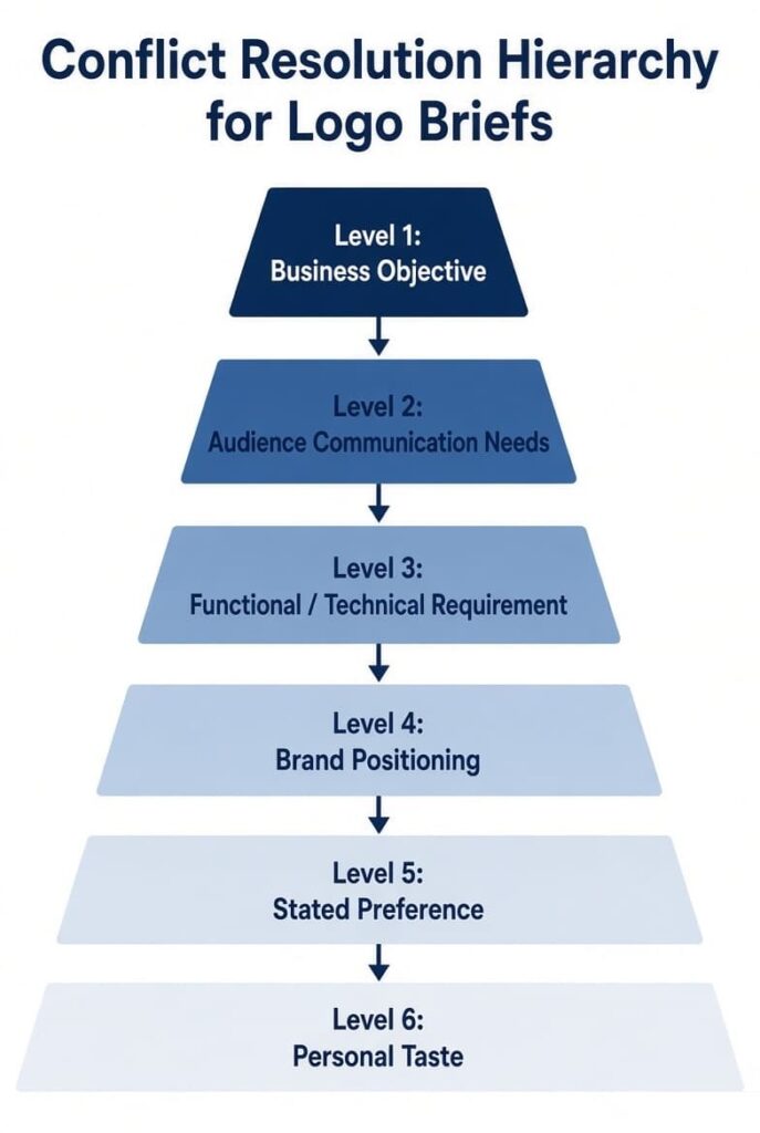
This hierarchy gives both the client and the designer a rational way to resolve disagreements without endless debate.
What NOT to Put in a Logo Design Brief
Avoid:
- Contradictory instructions without a ranking method
- Too many unrelated visual references without explanation
- Requests to copy competitor logos
- Vague aspirational language (“make it viral,” “make everyone like it”)
- Excessive personal preferences with no audience or business connection
- Exact design instructions that eliminate exploration
- Unclear or nonexistent target audience
- Unrealistic deadlines
- Undefined or expanding deliverables
- Feedback from many people without a single decision-maker
How Specific Should a Logo Design Brief Be?
Too vague
“Create a modern logo for our company.”
Too prescriptive
“Use this exact font, this exact icon, these exact proportions, and this exact color palette.”
Appropriate
“We want a professional but approachable identity for small-business clients. The logo should feel modern and trustworthy without looking overly corporate. We prefer a clean visual system but remain open to different logo structures.”
The brief should define the problem, the audience, the constraints, and the preferred direction while leaving the visual solution open enough for professional exploration. Specificity about the problem is valuable. Specificity about the exact visual answer is usually counterproductive.
A practical length principle: a logo brief should be long enough to remove ambiguity, but short enough that a designer can identify the core problem in one reading.
Logo vs. Identity Project Boundary
A logo is one identity asset. If the project also requires a full color system, typography system, imagery direction, layout principles, or brand guidelines, the brief should explicitly expand from a logo project into an identity project. State the boundary clearly so scope and budget remain aligned.
Step-by-Step: How to Write Your Logo Design Brief
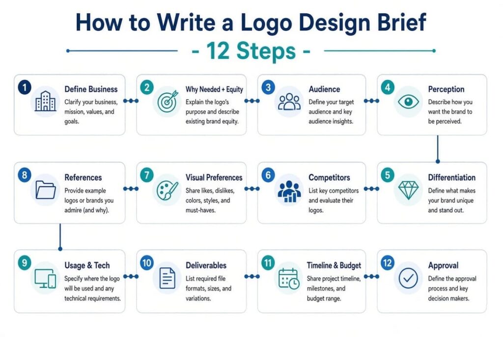
- Define the business — What does the company do?
- Explain why the logo is needed — What problem or opportunity is driving this? For redesigns, map Keep / Change / Remove / Investigate.
- Define the audience — Who needs to connect with this identity?
- Define desired perception — What 3–5 qualities should people associate with the brand?
- Explain differentiation — What makes the brand different?
- Research competitors — Map the visual landscape using the analysis method above.
- Define visual preferences — Label Must / Prefer / Avoid / Open.
- Provide references — Classify the reason for each like and dislike.
- Define usage and technical constraints — Where will it appear and what production conditions matter?
- Define deliverables and variations — Only what is actually required.
- Define timeline and budget — Match scope to investment.
- Define the approval process — Who decides, and how is feedback handled?
Final Brief Quality Test
Before sending the brief, answer these ten questions. If any answer is unclear, the brief is not finished.
- What does the business do?
- Who is the primary audience?
- Why is the logo changing or being created now?
- What should change, and what must remain?
- What should the logo communicate?
- How must it differentiate from the existing visual landscape?
- Where will the logo actually be used, and what are the critical technical constraints?
- What are the hard requirements versus preferences?
- Who has final approval authority?
- Can a designer identify the core problem after reading this once?
Logo Design Brief Template
Logo Design Brief
Complete this document and send it to your designer. Fill only what you know. Leave blank anything you’re unsure about.
1. Brand Information
What does the business actually do?
Example: “We provide online bookkeeping for small Canadian service businesses.”
2. Project Background
Why are we creating or changing the logo now?
3. Design Objective
What should the new logo achieve?
4. Target Audience
Who are the primary people this logo must work on? Be specific. Avoid “everyone”.
5. Brand Differentiation
6. Logo Usage & Technical Constraints
Where will the logo actually appear and what technical limits exist?
7. Approval Process
8. Brand Personality
After seeing the logo, what 3–5 qualities should people associate with the brand?
9. Competitors
10. Visual Direction
Label each item: Must / Prefer / Avoid / Open
11. References
For each example write why (typography, shape, tone, simplicity…)
12. Required Variations & Deliverables
13. Timeline & Budget
14. Color
15. Typography & Logo Structure (optional)
Final Quality Check — Before Sending
Can a designer answer these after reading once?
- What does the business do?
- Who is the audience?
- Why is the logo changing?
- What must stay / what can change?
- Where will it be used and what technical limits exist?
- Who has final approval?
Frequently Asked Decision Questions
How long should a logo design brief be?
Long enough to remove ambiguity about the problem, audience, and constraints, short enough that the core problem is clear in one reading.
Do I need a full brand strategy before writing a logo brief?
No. You need clarity on who you serve and why customers choose you. If those answers are missing, the logo project may be starting too early.
What if I don’t know what style I want?
That is normal. Provide audience, objective, and a few references with reasons. Leave structure and exact style Open.
Should I give the designer a color palette or font?
Only if they are established brand assets that must be retained. Otherwise treat them as Prefer or Open.
How many references should I provide?
Two to five likes and a similar number of dislikes, each with a specific reason, is usually enough.
What if stakeholders disagree?
Use the conflict hierarchy (objective → audience → function → positioning → preference → personal taste) and identify one final decision-maker in the brief.
What information is essential for a logo redesign?
Existing equity: what must stay, what can change, what should disappear, and any recognition or legal constraints.
A good logo design brief is a decision-making system, not a checklist. It establishes the problem, the audience, the constraints, and the priorities while leaving the visual solution open for professional exploration. Use the hierarchy, the Must / Prefer / Avoid / Open labels, the redesign equity questions, the conflict ranking, and the final quality test to produce a brief that is both focused and complete. When those elements are clear, the designer can concentrate on solving the right problem instead of clarifying the brief through multiple rounds of work.
Leave a Reply