
A logo designer’s portfolio is the only piece of evidence you have before you pay anyone a deposit. Everything else — the sales page, the testimonials, the price list — is marketing copy the designer wrote about themselves. The portfolio is the one thing you can actually inspect. And most business owners inspect it wrong: they scroll for ten seconds, decide whether the logos “look nice,” and move on. That ten-second scroll is how founders end up with a mark that’s a recolored template, a design nobody can explain, or a file set that can’t be used anywhere except the one Instagram post it was shown in.
Evaluating a portfolio properly takes closer to twenty minutes than ten seconds, and it doesn’t require any design training. It requires knowing what to look for, in what order, and what the absence of certain things actually means. This article gives you that method: a concrete framework for judging range, process, originality, and technical competence, a checklist of the specific red flags that predict a bad project, and a scoring system you can apply to any designer’s site before you ever get on a call.
Why Portfolio Evaluation Matters More Than It Looks
A logo is not a one-time purchase — it’s the visual anchor for every piece of marketing a business produces for years. A weak evaluation process now shows up later as an unusable file when a printer asks for vector artwork, a mark that looks amateurish next to a competitor’s, or a redesign project six months in because the first version never fit the brand. Poor logo design can quietly work against a growing business in ways that are hard to trace back to the original hiring decision — inconsistent brand recognition, a mark that doesn’t scale to signage or app icons, or an identity that has to be scrapped and redone at real cost. Conversely, a well-designed logo measurably supports business growth by making a brand memorable, trustworthy, and easy to recognize across every touchpoint it appears on. The portfolio review is the checkpoint where you catch the difference between those two outcomes before you’ve spent a dollar.
What a Portfolio Is Actually Supposed to Prove
Before you look at a single logo, it helps to know what a portfolio is evidence of. A finished logo image proves the designer can produce something that looks acceptable in a screenshot. It does not, by itself, prove that they can:
- Solve a specific business problem rather than just apply a trend
- Work within real constraints (a tight budget, an existing product name, a crowded competitive category)
- Explain why a shape, color, or typeface choice was made
- Produce a mark that still works at 16 pixels, in one color, on a truck door, and on a business card
- Deliver files a printer, web developer, and sign shop can all use without asking for something else
A portfolio that only shows pretty final images answers the first question and none of the rest. A portfolio built around case studies, even short ones, starts answering all five. That distinction is the single most useful thing to hold onto as you read the rest of this framework.
The Core Evaluation Framework: Eight Things to Check, in Order
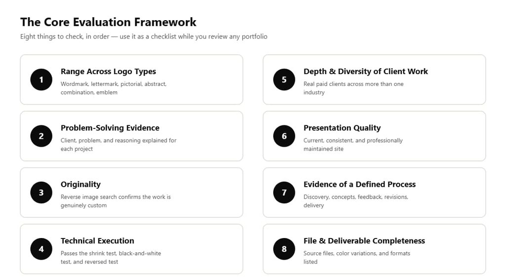
The eight-point framework at a glance — use it as a checklist while you review any portfolio
This framework draws on how professional design organizations formally assess portfolios. The American Institute of Graphic Arts (AIGA), the U.S.’s oldest professional association for design, publishes a portfolio assessment rubric used to evaluate professional-level design work across categories including problem definition, creative justification, design process, research application, and professionalism. The framework below adapts that same underlying logic — evidence of thinking, not just evidence of aesthetics — specifically for someone hiring a logo designer rather than reviewing a design job candidate.
1. Range Across Logo Types, Not Just Range of Style
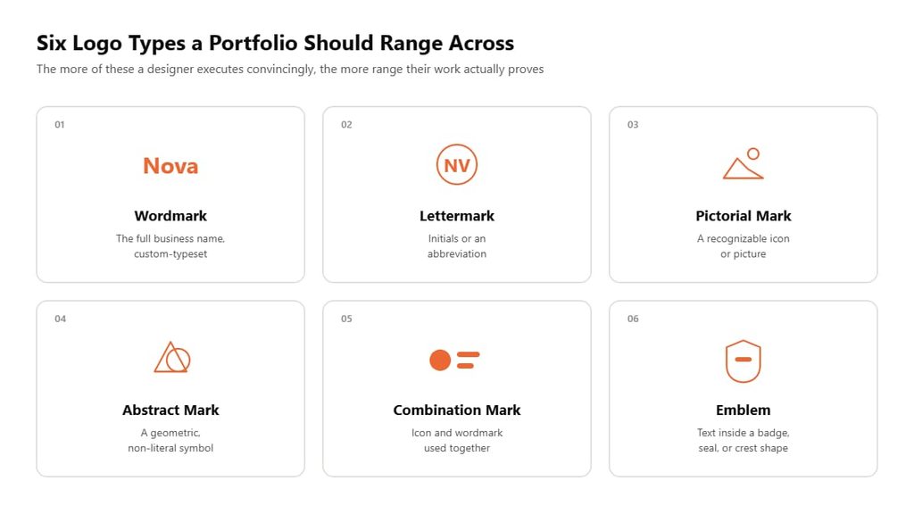
Six recognized logo categories — the more of these a designer can execute convincingly, the more range their portfolio actually proves
A logo isn’t one thing. Professional identity design generally falls into six recognized categories, and a designer’s ability to move between them tells you whether they’re solving each brief on its own terms or defaulting to whatever they’re most comfortable drawing:
| Logo type | What it is | What it signals if done well |
|---|---|---|
| Wordmark | The full business name, custom-typeset (e.g., Coca-Cola, Google) | Strong typography and letter-spacing skill |
| Lettermark | Initials or an abbreviation (e.g., IBM, HBO) | Ability to make simple forms distinctive |
| Pictorial mark | A recognizable icon or picture (e.g., Apple, the WWF panda) | Illustration and iconography skill |
| Abstract mark | A geometric, non-literal symbol (e.g., Pepsi’s globe, Nike’s swoosh) | Comfort with shape, geometry, and meaning-through-form |
| Combination mark | Icon plus wordmark used together | Ability to balance two elements as one cohesive system |
| Emblem | Text inside a badge, seal, or crest shape | Precision work and traditional/heritage styling |
A portfolio full of nothing but abstract geometric marks isn’t necessarily bad — it may mean the designer has a strong point of view — but if every single project in the portfolio looks like a variation on the same template with different colors, that’s a different problem entirely: it suggests the designer is reapplying one formula rather than starting fresh from each client’s brief. What you want to see is evidence the designer can move across at least three or four of these six categories convincingly, because that range is what proves they’re designing for the client’s brand, not for their own aesthetic comfort zone.
2. Problem-Solving Evidence, Not Just Final Art
For each featured project, look for a short explanation of what the business does, who its audience is, and why the final logo makes sense for that specific combination. This doesn’t need to be a 2,000-word case study. Design talent platform Toptal’s breakdown of case study portfolios makes the same point from the hiring side: a strong project narrative names the client and industry, states the specific problem being solved, describes the designer’s actual role and constraints, walks through the steps taken, and closes with the outcome — and it does this in roughly a minute or two of reading, not an essay. The absence of this is just as informative as its presence. If every project in a portfolio is an image with no caption beyond “Logo for [Client],” you are evaluating decoration, not design thinking, and you have no way to tell whether the designer solved a problem or got lucky with a shape.
3. Originality — Can You Verify the Work Is Actually Custom?
This is the check most business owners skip, and it’s the one most worth doing. Run a handful of distinctive elements from a few portfolio logos through a reverse image search (Google Images or TinEye). You’re looking for two things: whether the exact logo appears on stock marketplaces or logo-maker galleries under a different business name, and whether it appears in other designers’ portfolios as their own work. Either result is disqualifying, and the check takes about two minutes per project — do it before you contact anyone, not after you’ve already had a good conversation with them.
It matters for a reason beyond honesty: logos built from stock elements or generated through automated logo-maker software carry real legal exposure. Trademark protection generally depends on a mark being distinctive and exclusive to one business in its category, and design and IP commentary on this is direct — a mark assembled from shared stock elements is much harder to register or defend for exactly that reason, since the same elements are available to any other business that licenses them. In practice, that means multiple companies can end up with the same or a confusingly similar mark, and using stock assets beyond their license terms can trigger takedown notices or legal claims from the asset’s original owner.
A portfolio piece that turns out to be a lightly modified stock graphic isn’t just an aesthetic disappointment; it’s a liability you’d be inheriting. This is also the core argument for choosing genuinely custom logo design over an automated logo-maker tool: a mark assembled from a shared template library was never built to be legally or visually exclusive to your business in the first place.
4. Technical Execution — Does It Actually Work as a Logo?
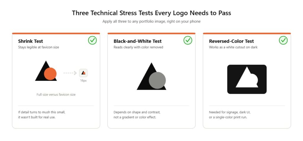
The three technical stress tests every working logo needs to pass
A logo is not a finished piece of art; it’s a functional system that has to perform at wildly different sizes and in wildly different contexts. Established design guidance on logo versatility, such as Vistaprint’s breakdown of core logo design principles, converges on a small set of practical stress tests, and you can apply every one of them just by looking at a portfolio image on your phone:
- The shrink test: Does the mark stay legible when reduced to the size of a favicon or a social media profile icon? If detail disappears into mush at small sizes, the design wasn’t built with real-world use in mind.
- The black-and-white test: Does the logo still read clearly with all color removed, using only shape and contrast? A mark that depends entirely on a gradient or color effect to be recognizable will fail the moment it needs to go on a single-color stamp, an embroidered polo, or a fax cover sheet.
- The one-color / reversed test: Can you picture the same mark working as a white cutout on a dark background (a sign, a dark app UI, a black t-shirt)? If a portfolio only ever shows the logo on a clean white mockup, that’s worth asking about directly.
- Consistency across sizes: Do combination marks scale as a coherent unit, or does the icon get separated from the wordmark and look unbalanced?
Many portfolio sites already show this by presenting a small logo suite — a full lockup, a stacked version, and an icon-only mark — for each project, precisely because a single static image can’t answer these questions on its own.
5. Depth and Diversity of Real Client Work
Distinguish personal/practice projects from paid client work. Personal projects aren’t disqualifying — everyone has some — but a portfolio that’s entirely self-initiated concept work, with no evidence of a real client relationship, budget constraint, or feedback cycle, hasn’t been tested against the thing you’re about to put it through: a real business with real opinions and a real deadline. Look for variety in industry too. A designer who has only ever designed for coffee shops may struggle with the different visual language a law firm or a SaaS company needs. Breadth across a few different industries — professional services, hospitality, retail, technology — is a reasonable proxy for adaptability.
6. Presentation Quality and Professionalism
How the portfolio itself is built and maintained is itself a data point. Is the site current, or is the most recent project three years old? Are the mockups clean and consistent, or thrown together with mismatched lighting and inconsistent framing? Are there typos in the project descriptions? A designer selling attention to visual detail should be able to demonstrate that same attention in how they present their own work. This is a soft signal, not a disqualifier on its own — but combined with any of the red flags below, it should raise your confidence threshold.
Where the portfolio lives matters too, though it’s a secondary signal rather than a deciding one. A personal website the designer controls directly usually presents work in more depth — full case studies, custom layouts, embedded process notes — than a profile on a shared creative platform like Behance or Dribbble, where the format is standardized and process detail is often trimmed to fit the platform’s card-based layout. Neither location is disqualifying by itself; plenty of strong designers maintain both. But if a designer’s only visible portfolio is a handful of thumbnails on a shared platform with no independent site and no case studies behind any of them, treat that as a prompt to ask for more, not as proof of skill on its own.
7. Evidence of a Defined Process
A portfolio or “About” page that walks through how the designer actually works — discovery questions, concept development, a feedback and revision stage, final delivery — tells you what to expect before you sign anything. It’s the difference between hiring someone who has a repeatable system and hiring someone who is improvising per project. For reference, a documented process typically looks something like: an initial discovery and briefing stage to understand the business, a concept development phase where the designer explores directions, a presentation and feedback round, a defined revision stage, and a final delivery stage with organized files. If a portfolio or site gives you zero visibility into any of that sequence, it’s worth asking about directly before moving forward — and writing a clear brief yourself up front makes it much easier to judge whether a designer’s process actually responds to what you asked for.
8. File and Deliverable Completeness (Where Visible)
Some portfolios explicitly list what a finished project included — source files, color variations, transparent-background versions, social media formats. This is a genuinely useful signal because it tells you the designer thinks about the logo’s full lifecycle, not just the reveal image. A complete professional deliverable set typically includes layered source files (AI or EPS), a print-ready PDF, a high-resolution PNG with a transparent background, a web-friendly JPG, and a scalable SVG for web use — plus black-and-white and reversed color variations. If a portfolio project only shows one flat JPEG with no mention of what the client actually received, that’s a gap worth asking about, because what’s actually included in a logo design package varies enormously between providers, and the portfolio is your first chance to gauge which kind of provider you’re looking at.
Strong Signals vs. Weak Signals: A Side-by-Side Comparison
| Evaluation area | Strong signal | Weak / warning signal |
|---|---|---|
| Style range | Multiple logo types (wordmark, pictorial, abstract, combination) executed convincingly | Every project looks like the same template recolored |
| Explanation | Short case notes on client, problem, and reasoning for each project | Bare images with no context, just “Logo for [Client]” |
| Originality | No matches on reverse image search; distinct concepts per client | Logo (or close variant) appears on stock sites or in other designers’ portfolios |
| Technical execution | Works at small size, in black-and-white, and reversed | Only shown as one large color image on a white background |
| Client evidence | Named or describable real businesses, mix of industries | Entirely unnamed “concept” projects with no client context |
| File completeness | Deliverables (source files, variations, formats) referenced or shown | No mention of what the client actually received |
| Process visibility | Clear steps from discovery through delivery, feedback rounds described | No description of how projects actually happened |
| Presentation | Current, consistent, error-free site | Outdated, inconsistent mockups, broken links, typos |
| Recency | Projects from the last 1–2 years | Portfolio hasn’t been updated in several years |
| Testimonials | Specific, tied to a describable project or outcome | Generic (“Great to work with!”) with no project detail |
A Simple Scoring System You Can Use on Any Portfolio
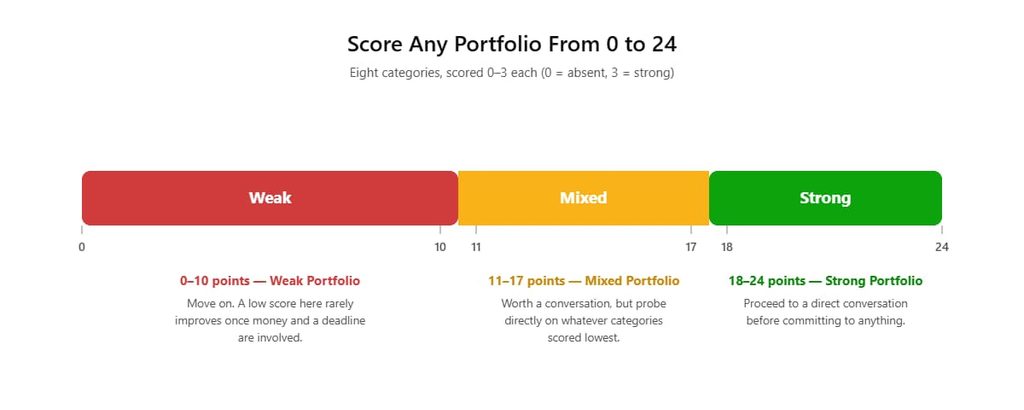
Score any portfolio from 0–24 and know instantly which range it falls into
Score each of the eight framework categories above from 0 to 3 as you review a portfolio (0 = absent, 1 = weak, 2 = adequate, 3 = strong). That’s a possible 24 points.
- 18–24: Strong portfolio. Proceed to a direct conversation and ask the specific questions that separate a good fit from a bad one before committing.
- 11–17: Mixed portfolio. Worth a conversation, but probe directly on whatever categories scored lowest — don’t assume the gap will resolve itself once you’re working together.
- 0–10: Weak portfolio. Move on. A low score at the evaluation stage rarely improves once money and a deadline are involved.
This isn’t a scientific instrument. It’s a structured way to stop yourself from making a purely emotional “I like these colors” decision, which is how most bad logo hires happen.
Red Flags Checklist
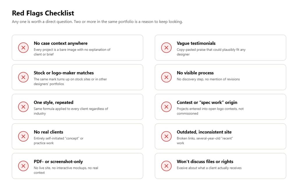
Any single item here is worth a direct question. Two or more in the same portfolio is a reason to keep looking elsewhere.
- No case context anywhere — every project is a bare image with no explanation of the client, industry, or brief.
- Stock or logo-maker matches on reverse image search, or a design that’s visibly a recolored version of a widely used icon-and-wordmark template.
- One style, repeated — the same typeface pairing, the same swoosh-and-circle formula, applied to every client regardless of industry.
- No real clients — the entire portfolio is self-initiated “concept” or “practice” work with nothing built for an actual paying business.
- PDF-only or screenshot-only presentation, with no live site, no interactive mockups, and no way to see the mark in context.
- Vague or copy-pasted testimonials that could plausibly belong to any designer for any project.
- No visible process — no discovery step, no mention of revisions, no explanation of how a project actually unfolded.
- Contest or “spec work” origin — projects that were entered into open logo contests rather than commissioned directly. AIGA, the design profession’s leading professional association, maintains an official position against speculative work, arguing that unpaid competitive design work discourages the research and iteration that produce genuinely effective outcomes, and that it carries real legal exposure around ownership and trade-dress rights for everyone involved. A portfolio built substantially on spec-contest entries is a portfolio built on projects with a track record of exactly the problems described above.
- Outdated or inconsistent site — broken image links, several-year-old “recent work,” inconsistent mockup styles.
- Unwillingness to discuss files or rights when asked directly what a client actually receives and who owns it afterward.
Finding one flag isn’t a reason to walk away on the spot — it’s a reason to ask a direct question and watch how the designer answers it. A designer who explains a gap candidly (“that project predates my current process, here’s what I do now”) is behaving very differently from one who gets defensive or changes the subject. The second reaction is more diagnostic than the original gap.
What a Strong Case Study Actually Looks Like in Practice
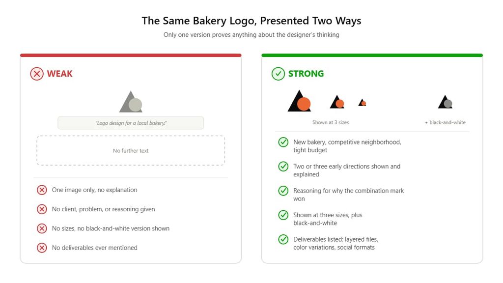
To make the framework concrete, here’s what separates a strong project write-up from a weak one, using the same underlying project as an example.
Weak version: A single image labeled “Logo design for a local bakery.” No further text.
Strong version: A short paragraph establishing that the client was a new bakery entering a competitive neighborhood, needed a mark that read as handmade and warm without looking dated, and had a tight budget that ruled out a multi-week identity system. It shows two or three early directions that were explored and set aside, explains briefly why the final combination mark was chosen over the alternatives, and displays the finished logo at three sizes plus in black-and-white. It closes with what the client received: layered files, color variations, and social-ready formats.
The second version doesn’t need to be long to do its job. It needs to answer, specifically: what was the problem, what were the options, why did this option win, and does the result actually function as a working logo. This is what a documented five-stage process (discovery and briefing, concept development, presentation and feedback, revisions, and final delivery) actually produces when it’s followed on a real project rather than just listed on an “About” page; each stage leaves behind something concrete — a brief, a set of directions, feedback notes, a revised file — that a designer can point back to. Studios and freelancers that run this kind of process on every project, Graphic Designers Group’s logo design service among them, tend to have that documentation across most of their portfolio rather than in one or two showcase pieces. That consistency is a more reliable thing to check for than polish alone, since depth that repeats across many projects is much harder to fake than depth in a single highlight reel.
Portfolio Evaluation Doesn’t Replace Due Diligence — It Starts It
A strong portfolio earns a conversation; it doesn’t end the process. Once a portfolio clears the framework above, there’s still a separate, practical layer of questions worth working through: how pricing is structured, what the realistic timeline looks like, and what happens if the first concepts miss the mark. Typical professional logo design pricing varies enormously based on scope, and a portfolio alone won’t tell you where a given designer sits on that spectrum; that’s a direct question for the conversation that follows. The same goes for timeline. Realistic turnaround for a professional logo project is typically measured in business days to a couple of weeks depending on revision rounds, not the same-day delivery some logo-mill services advertise, and a portfolio that shows deep, iterative case studies is a hint that the designer behind it isn’t working at same-day speed either.
It’s also worth deciding early whether you’re evaluating an individual freelancer or a small studio/agency, because the portfolio review criteria shift slightly between the two. The tradeoffs between a freelance designer and a full design agency go beyond price. They touch on backup coverage if someone’s unavailable, the range of skills available beyond the logo itself, and how formalized the process and contracts tend to be. A freelancer’s portfolio might be smaller and more personal; an agency’s portfolio might show a defined, repeatable methodology across a larger volume of projects. Neither is automatically better, but you should know which one you’re actually looking at.
If a business already has a logo and is portfolio-shopping because the current mark isn’t working, it’s worth pinning down why before hiring anyone. Sometimes the honest answer is that it’s time for a full redesign because the brand itself has outgrown the original mark; other times a narrower fix is enough.
It’s also worth clarifying scope before the first call. Some businesses need just a mark, while others are really asking whether they need a logo or a full brand identity system: colors, typography, patterns, and business collateral built around the mark. If it’s the latter, brand identity pricing is a materially different conversation than logo pricing alone, and a portfolio’s identity-system projects, not just single logo images, become the more relevant thing to review.
Frequently Asked Questions
How many projects should be in a portfolio before I take it seriously?
There’s no fixed number, but look for enough variety to judge range: roughly eight to fifteen well-documented projects tells you more than fifty bare thumbnails. A portfolio with only two or three projects isn’t automatically disqualifying for a newer designer, but it does mean you should weight the depth of those few case studies more heavily, since there’s less evidence overall to work from.
Is it a red flag if every logo in the portfolio has a similar style?
It depends on why. If the designer has a genuine visual point of view and clients are hiring them specifically for that aesthetic, a consistent style can be a feature, not a flaw. It becomes a red flag when the “style” is really a template (the same shape, the same font pairing, the same color formula) applied regardless of what the client’s business or audience actually calls for. The test is whether you can tell the projects apart by client, not just by color.
Should I trust a portfolio that only shows finished logos with no process explanation?
Treat it as incomplete rather than disqualifying. A finished image only proves aesthetic competence; it doesn’t prove the designer can solve your specific problem or explain their reasoning. If the portfolio has no process notes, ask for them directly before moving forward — a professional designer should be able to walk you through how at least one or two projects actually unfolded.
How do I check if a logo in a portfolio is actually original and not a stock template?
Run a reverse image search (Google Images or TinEye) on a few distinctive marks from the portfolio. Check whether the same or a very similar logo appears on stock/logo-marketplace sites, in other designers’ portfolios, or attached to a different business entirely. Any of those results is a serious concern, both for originality and for the legal exclusivity of the mark itself.
Does a smaller or newer portfolio automatically mean a less capable designer?
No. Portfolio size correlates with career length more than with skill. A newer designer’s portfolio should simply be evaluated more on depth per project (process, reasoning, technical execution) since there’s less overall volume to draw confidence from.
Should I ask to see concepts that weren’t chosen by the client?
Yes, when possible. Seeing two or three rejected directions alongside the final choice tells you far more about a designer’s range and decision-making than the winning logo alone, because it shows the actual thinking process rather than just the outcome.
Is it a problem if a portfolio doesn’t mention what files clients received?
It’s a gap worth closing before hiring, not necessarily before shortlisting. Ask directly what a completed project includes: source files, variations, formats. This affects whether you’ll actually be able to use the logo everywhere you need it (print, web, signage, social) once the project is done.
What if a portfolio includes work from logo design contests?
Treat it as a caution flag rather than an automatic disqualifier, but understand what it signals. Speculative contest work is work done without a paid commission or a real client relationship, and the profession’s leading association has taken a formal position against it specifically because it tends to skip the research, iteration, and feedback cycles that produce genuinely effective logos. A portfolio built mostly on contest entries has less evidence of real client collaboration than one built on commissioned projects.
Final Recommendation
Don’t evaluate a portfolio by asking “do I like these logos.” Ask, project by project: does this show a real problem being solved, is the work verifiably original, does the mark actually function as a logo rather than just an image, and is there a real client and a real process behind it. A designer who scores well across all four questions — even with a modest-sized portfolio — is a safer commitment than a designer with fifty polished thumbnails and zero explanation behind any of them. Run the scoring system above on two or three candidates side by side before you talk pricing with anyone; it turns a subjective first impression into a comparison you can actually defend, and it’s the difference between hiring a designer who happened to make something you liked once, and hiring one who can reliably do it again for your specific business.
Leave a Reply